Tuesday 28 October 2014

Life Drawing

On Friday we did Life Drawing! I had never done it before so I was quite nervous, but it was absolutely find and really fun!

On the first sketch, Tim told us to draw not the figure in front of us, but just anything; a scribble, blob, whatever. This is what I drew (it's horrendous HA): - This is meant to represent the absence of someone.

On the second sketch, Tim told us to fill the canvas with charcoal, then rub out anything that resembled a figure. This is mine: - This is meant to represent the presence of someone or something. As if they've left the room. 

On the third sketch, we were told to doodle. We were given 3 minutes, then 2, then 1 to not take our pen off the paper. This is to represent the free energy/movement that the person has, unlike the previous charcoal drawings. Here is mine:

Even though it was fun, I've come to the conclusion that I am awful at it!!!!

VISUAL CV

For my visual CV I created it on Illustrator. I wanted it to still look very professional so I kept to a simple, but bold layout with a consistent colour theme. 


Friday 17 October 2014

WHAT AM I LIKE?

We were briefed to create an A3 mood board displaying 10/13 categories which we had to choose that represented ourselves. The categories I chose were:
  • Food
  • Animal
  • Weather
  • Transport
  • Past time
  • Music
  • Comfort
  • Place
  • Shoes
  • Clothes

This is my mood board:

I created this on Photoshop as I am not comfortable with drawing or illustration. However I thought I should make it a bit more interesting than a digital mood board (what we always do) so I drew some categories and scanned it in. When I scanned them in and tried to put it together, the illustrations didn't quite look right with the digital images, so I decided to make all my images look like they have a watercolour effect to blend in with the illustrations. I downloaded some watercolour brushes online and made the canvas grain larger, so that it looks like an arty piece of work. Reflecting on this, I am still not happy with the layout; it could have been neater, but I did experiment with illustration. I will also probably make another digital what am I like.

Friday 10 October 2014

FCP year 2

Ahhhh year two of FCP. This year looks MUCH more exciting. It is mainly about self promotion & improving on our research.

This past week, our lectures and seminars have been about improving our research (the context) in order to do it properly until we get to a "big idea" - which will lead us to the "creative idea" (what our idea looks like) until we finally execute it to the consumers eye. As research can be very boring and long, we may not carry it out properly. Therefore we should make it interesting, like carrying out experiments! E.g. Derren Brown's research experiments are very exciting to watch and we learn a lot from them!

Self Promotion work will start next week, but we are all learning this to follow up to our Berlin trip in January where will have created business cards and will use those to get into trade shows at Berlin Fashion Week.


Thursday 5 June 2014

NEW PORTFOLIO & BRAND LAUNCH REPORT

I re-did my visual awareness portfolio and put it on issuu, and i finally have completed my 3000 word brand launch report! Here they are: 

http://issuu.com/aniakanwal

Wednesday 28 May 2014

Our Presentation......

WELL THAT WAS EVENTFUL.

We worked 5 long months on perfecting our presentation, and were so proud of it. However, we downloaded a font called "moon flower" and used that throughout the whole presentation. When we put our memory stick in the university computers, the whole presentation came up in WINGDINGS!!!!!!!! because obviously the uni computers didn't have moon flower downloaded, and we didn't even think about that! I was fuming! So we just had to read our cue cards showing all the slides... 

Ah well, at least it's not third year. A learning curve for next time I guess...


Final photoshoot images

These are our final photo-shoot images which we used in our presentation for our campaign ads.
Campaign ad
Campaign ad
Perfume blotter

Sunday 11 May 2014

Fragrance project photoshoot!

This week, we did our photoshoot for our concept! Our fragrance concept is for dry skin - so it is a moisturiser which acts as a base coat to hydrate the skin, and then the matching fragrance scent with it so it lasts longer on the skin. 

Our photoshoot/video shoot idea was to throw water on male and female models (to address the target consumer) and then edit it so that the video reverses (the water coming off them in slow motion) and then editing it so the water is being thrown back onto them as if to 'add moisture' to them. It was so fun to shoot! (maybe not for the models...) We used my Canon 600D.

First we decided to have a white backdrop so we bought a clear PVA sheet and spray painted it white... that took a while... Turns out it didn't even dry properly and went all patchy but we used it anyway!

(This isn't my snapchat, it's Whitley's but it shows us "behind the scenes" haha!)

Monday 21 April 2014

FCP update

I haven't blogged in a month, it seems like ages!
We were asked to do a 1000 word essay on comparing an advert, and also working in our groups to create and come up with a fragrance concept and our presentations on research are due this week. we recently had to change our skin-care concept as we were told by a guest tutor that it is impossible to create a perfume for sensitive skin! So a few days ago, when we were making the perfume we changed the concept to "Freedom" - basing around the concept of travel. Our first fragrance is going to be based on the feeling/scent of being trapped, our second (the one we made) is "On a journey" - which resembles the smell of fresh air, citrus, grass and "freedom". Our other fragrances are going to be based on exploration and travelling the world, but this is all we have come up with so far. 

Sunday 23 March 2014

My first tat! My Mandala.

From watching beautycrush and Ricky Richards' videos, I adored their tattoos and they got some of them done at The Circle in Soho, so I decided to get my first one done there! I chose a Mandala because I think the patterns are absolutely beautiful and look amazing on the skin! It doesn't necessarily mean anything, but to me that doesn't matter. I absolutely LOVE it and will definitely be getting more done there. They're all so friendly and welcoming.

It didn't hurt as much as i anticipated it to be actually, it felt just like a burning/scratching sensation and was definitely not worse than a bikini wax haha!! It took only 40 minutes and the healing was not bad at all, I hardly felt it... Why did I think the healing would be horrible?! I definitely want more tattoos already! Help.


Check them out at http://www.thecirclelondon.com
My tattooist: Math. Instagram: @evenmoreblack 

Wednesday 12 March 2014

London - Fragrance research

We went to London last week to do some primary research about our next project. Our Next project is to produce a new concept for a fragrance idea and then present it.

My group have decided to base our fragrance on a niche market, as we felt that people feel "tied" to the mass market. We did research in Nottingham for the Mass Market, and concentrated on the Niche for London as there were many boutiques we visited. The Niche fragrance stores we visited were lovely! Firstly, the customer service was phenomenal. 

We first went to a store called "Bloom perfumery" as we had an interview with a worker there. We were in there for about an hour and a half, and she told us EVERYTHING we need to know about perfume! She showed us all of the brands that they sell, and told us every story behind the concept of the brands. I learned from this that the niche perfume brands all have a story behind it in which they portray via their scents. For example, the brand "Blood Concept" is a brand which I found so interesting. At first when they lecturers told us about it, I thought it was just a perfume for your own personal blood type (which it can be too), but the lady in Bloom explained to us that each blood type, starting with the first ever one; O, represents life. So O represents the cavemen times - and it is made out of elements like leather and metal... the raw substances. Each one of the blood types represent the growth of life, and the last one; MA, represents the ending of the world (2012) called "plasma white". It is a totally different scent compared to the others and is made to smell human, free... (She told us that most people don't like that one, I could tell why... it does't smell very nice!!)

She told us that niche brands are allowed to express more freedom, e.g. Selling wise - as they are more personal to the consumer and it may take a couple of days for the consumer to buy a product as they go away and try a scent and come back to see if they like how it lasts.

We went to many boutiques, but Bloom Perfumery is where we got the most information. Another store is "Les senteurs" where the man was also very helpful. 


What I found most interesting about these unique stores was the VM and the decor. It was all so creative and so relevant to the brand and their story, I took a few pictures!


Tuesday 4 February 2014

My mate Michael Kors

So while I was in New York, I kinda went into 'YOLO' Mode, and bought myself a Michael Kors bag (which I do not regret at all because it's my baby). It is one of Michael Kors' new collections, and I saw it in the Michael Kors store and fell in love! I bought it in Macy's, as I got 10% off because I'm a tourist. (Although the sales woman in MK was trying desperately to sell it me at the solo store, bless.) I love the colour grey at the moment, I also bought a grey clutch and a grey jumper in New York! 


Tuesday 28 January 2014

Simple but powerful

(Own image)

London Fashion Week 2013 (Throwback)

I haven't blogged about LFW on this blog, as this is a fairly new blog and because it's around this time last year I thought I'd reminisce! 


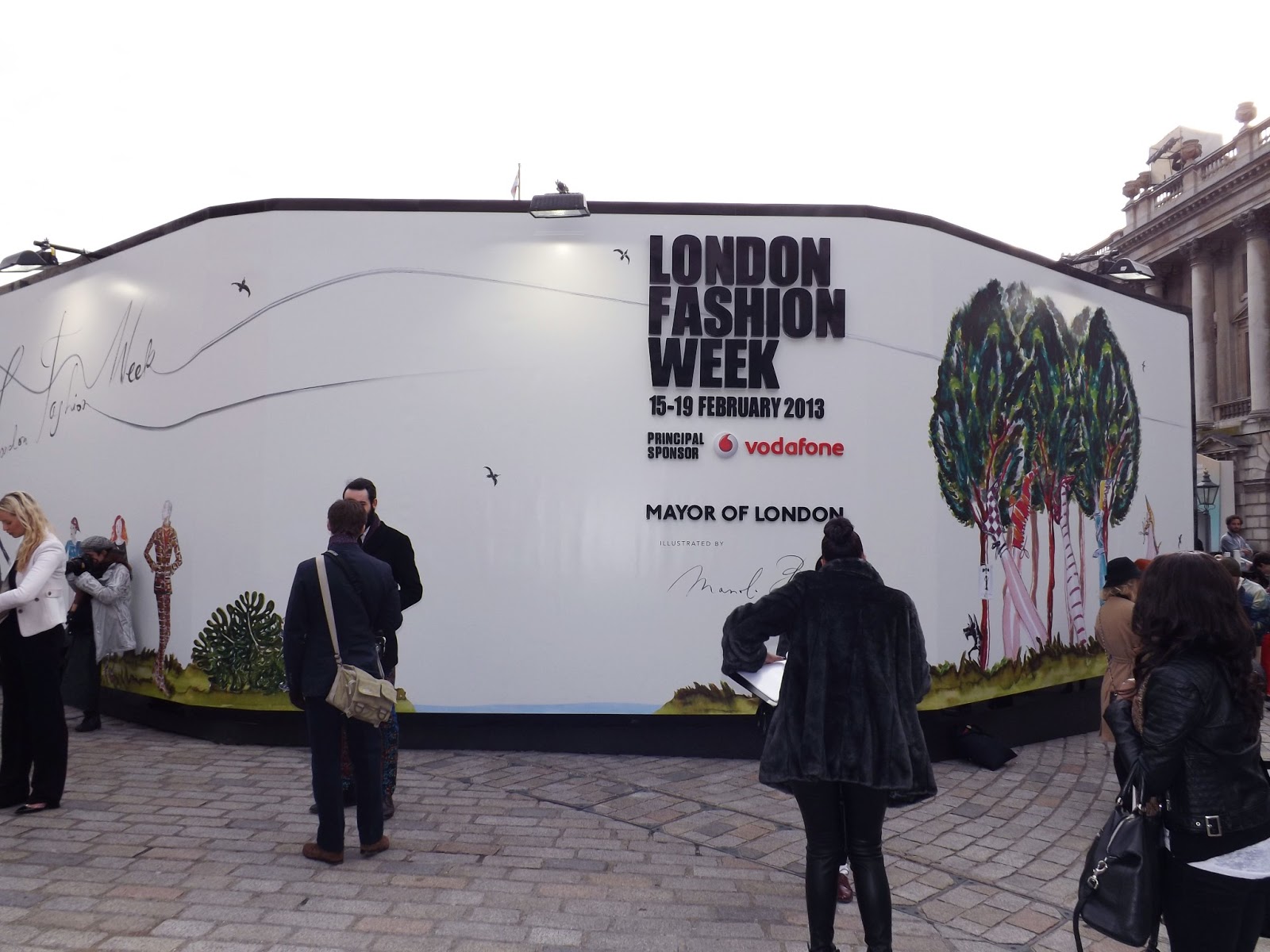
Day two of LFW marked my first time ever at LFW, and what can I say: It was an amazing experience. Becky and I arrived at Somerset house (which is so pretty!) and as we were competition winners, we were escorted to the Vodaphone VIP exclusive lounge where we got offered champagne and refreshments and spoke to the stylist Colomba Giacomini, who has worked for designers such as Louis Vuitton and Jimmy Choo! It was all extremely exciting. 

Vodaphone VIP lounge
(Awful picture but it's the only one I can find where I'm looking at the camera, ha!)

Soon after, we went upstairs which led to the Jasper Conran AW13 show, and I think it is safe to say, it is all about NEON. The show was phenominal and different to his usual style, but I loved it!
We also got given LFW Tote bags designed by Mulberry - which I was SO excited about - it's so beautiful! 
And finally... as London is one of my favourite cities, I had to take a few pictures.